
A hands-on review documenting the full experience of signing up, building a site, and working with WordPress.com’s tools. No fluff, just what actually happened.
I’ll start with the obvious question: why WordPress, of all places? Honestly, it wasn’t a hard decision. I’ve worked on WordPress for a while now, on and off, for different projects, and there’s a comfort in using something familiar. I know my way around it. I know where things live, what the dashboard looks like, how posts and pages talk to each other. So when I decided to finally build NotesBySara, I didn’t spend weeks comparing platforms or reading “Wix vs Squarespace vs WordPress” listicles. I just opened WordPress.com and got to work.
That said, “familiar” doesn’t mean “identical every time.” This time around, I did something a little different from my usual process.
The Actual Sign-Up Process
Before any of the theme decisions, there was the practical stuff: buying a domain and picking a plan. I want to be upfront here, this part was almost boring in how smooth it was, in a good way. No friction, no upsells hidden in fine print.
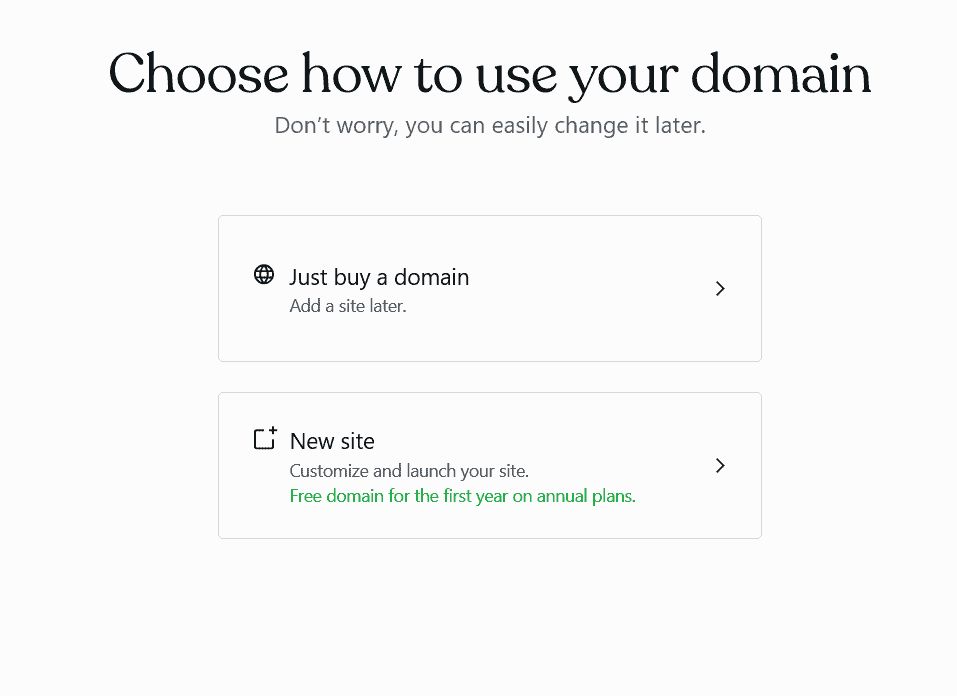
It started with picking a domain. I typed in the name I had in mind, and WordPress came back with a handful of options built around it, each with its own price. I went through them, compared, and picked the one that suited me best. Nothing complicated, just typing, scrolling, comparing.
Then it gave me an option I wasn’t expecting: I could buy just the domain on its own, or bundle it together with a site and a plan. I went with the latter. Since I already knew I wanted a real site out of this, not just a parked domain sitting around doing nothing, bundling made more sense than buying the domain separately and figuring the rest out later.
So I went with the Personal plan, and paid for the domain and the plan together for the full year upfront rather than month to month. That one decision alone ended up saving a noticeable amount of money compared to paying monthly, which I didn’t expect to matter as much as it did until I actually saw the total.
For the plan itself, the Personal tier runs at $4 a month if you pay annually, about $48 for the year, before taxes. It’s not the cheapest option WordPress.com offers, but it’s also not asking for much, and the perks made sense for what I needed:
- 6 GB of storage, which is more than enough for a blog like mine
- Unlimited pages, posts, users, and visitors, no caps waiting to surprise me later
- No ads shown to visitors, which mattered to me since I didn’t want my homepage cluttered with banners I didn’t choose
- A guided website builder, with some usage limits, but still useful for getting started
- Dozens of premium themes to pick from
- Free support if something goes sideways
- The ability to extend the site with WordPress plugins down the line
For a personal blog that isn’t trying to be a full business yet, this felt like the right level of investment. Not free-tier limited, not overkill either.
Going Through the Themes
This is where I actually spent some real time. WordPress.com had a genuinely good selection of themes to pick from, split across different tiers: some free, some only available on the Personal plan, some reserved for Business-level plans at a higher price. Since I’d already committed to Personal, I stuck to what was included there, which still left me with more than enough to work with.
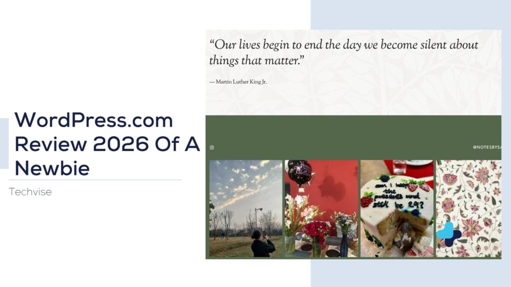
I narrowed it down to two or three I actually liked, and each one had its own personality: different color schemes, different fonts, different layouts already built in. That part took longer than I expected, just sitting there comparing how my content would look in each one, imagining the homepage with my actual words instead of placeholder text. Here’s the first one I liked.
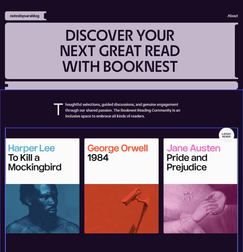
Honestly, this is the part I appreciated most about the whole process. Being handed a set of solid, ready-made options is so much faster than building from scratch. If I’d gone the route of coding everything myself, picking fonts, deciding on a color palette, figuring out spacing and layout from zero, it would’ve eaten an entire weekend, easily. Instead, it was just scrolling through well-designed themes, previewing how they’d actually look, and picking the one that felt right.
Noticing What’s New in the Editor
One thing that genuinely surprised me while I was editing my homepage was how clean everything lined up. Text blocks, the image gallery, the CTA section, all of it sat in proper alignment without me nudging a single thing into place. I didn’t have to eyeball spacing or guess whether something was a few pixels off. It just looked right by default.
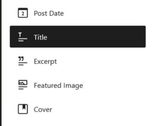
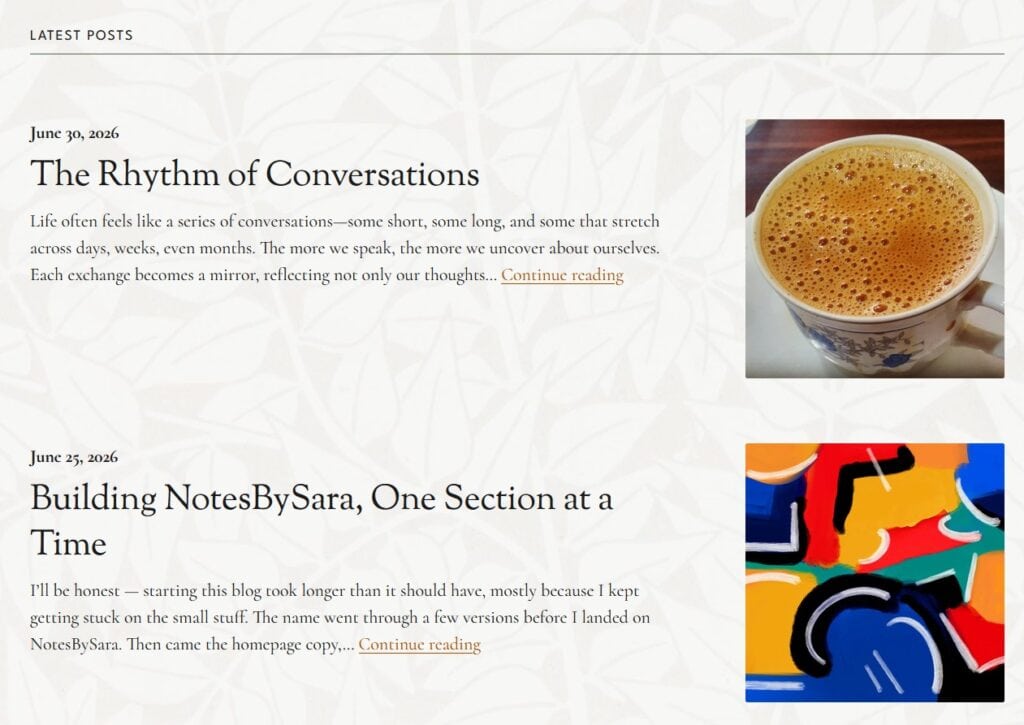
What really got me, though, was the blog post section. I added it expecting to manually pick and place each post, the way I’ve had to do on other platforms. Instead, I clicked it in, and it had already pulled my actual blog posts straight from what I’d published, no manual linking, no copying titles or images over one by one. It was already there, already populated, already updating itself.
That stood out to me because dynamic content like that is usually the hard part. Getting a section to automatically reflect your actual posts, instead of being a static block you have to update by hand every time you publish something new, is normally something you’d expect to set up manually or rely on a plugin for. Here it just worked the moment I dropped the block in.
This was the first time I’d actually built a site using one of their own themes instead of a separate visual builder, so I don’t have much to compare it to, whether that behavior is standard across their themes or specific to this updated editor. Either way, it’s the kind of thing that saves time later without you noticing it happening.
Where It Got Genuinely Easy
I went into this expecting at least one frustrating moment, a plugin that wouldn’t cooperate, a setting buried three menus deep, something. It didn’t really happen. The whole process, from buying the domain to picking the plan to setting up the theme, was smooth enough that it almost made me suspicious.
Some of that is probably because I already knew WordPress’s general logic going in. If this were my first time ever touching the platform, I imagine there’d be a slightly steeper learning curve, especially around understanding the difference between pages and posts, or figuring out what each theme’s customization options actually control. But even accounting for that, WordPress.com seems to have done a decent job making the onboarding experience approachable.
Writing the Actual Content
Building the site is honestly the easy part. Writing the words that go on it is where the real work happens, and that part doesn’t get talked about enough in these reviews.
Everything on NotesBySara lives on the homepage, so whatever I wrote there had to do all the work at once. The part that took the longest wasn’t even the writing itself, it was choosing a quote. I went through a lot of quotes that actually mean something to me before landing on the one that felt right, and once I had that anchor, the rest of the copy started falling into place around it.
The real time sink, though, was the pictures. Picking images that actually matched the tone I was going for took far longer than I expected, way more than the writing did. It’s one thing to know what you want a page to say, it’s another to find visuals that say the same thing without having to explain it.
That part of the process has nothing to do with WordPress itself, but it’s worth mentioning because it’s the part that actually took time. The platform gave me the structure. Filling that structure with something honest, and finding images to match, was on me.
The Verdict
Would I recommend WordPress.com? Yes, without much hesitation, especially for someone who wants a personal blog that doesn’t require fighting with code or hiring a developer. The Personal plan strikes a fair balance between cost and features, the theme options are genuinely solid even without a full visual builder, and the sign-up process was about as painless as these things get.
It’s not flashy. It’s not going to wow you with some groundbreaking feature you’ve never seen before. But for what I needed, a clean, customizable home for NotesBySara, it did exactly what it was supposed to do, and it did it without making me work harder than necessary.
A few minutes to pick a domain, a bundle that saved me money by paying annually, a theme that fit without touching a single line of code, and a plan that didn’t oversell itself. That’s about as good a review as I can give a website platform.